Beatport Dark Theme
alternative colour scheme for new Beatport
18 July 2011
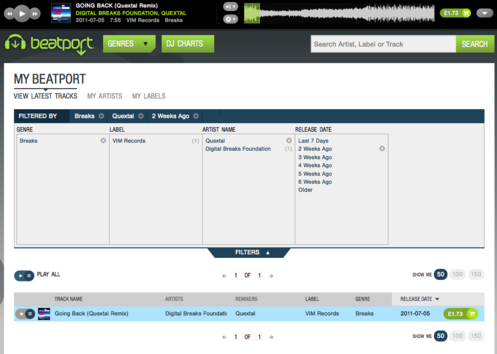
You may have seen that Beatport has had a facelift recently. The old creakily slow Flash interface that you needed to peer at with binoculars to read the text has finally been swept into the bin, to be replaced by a swanky new HTML5-based site. “New Beatport” has a nice clean design, and seems more responsive, and a lot more intuitive.
So congrats to Beatport, and indeed, yay… but I have a problem with it. It’s all gone a bit… well… white…
Maybe it’s because I spent my formative years programming on greenscreen monitors, but I’ve never found black text on a white background very pleasant to look at on a screen, and I dispute the rationale behind it which is leading to it becoming a de facto standard on the web. Black-on-white is certainly good for printed text on paper, but on a backlit computer screen, it means you’re staring at bright unfiltered fluorescent tubes (or LED equivalents) all day. I don’t think it’s a good idea for anyone, but it’s a more serious problem for me personally: my eyes are unusually sensitive to light and I really can’t be spending hours tune shopping on Beatport with the glare of a thousand suns boring into my retinas.
So I fixed it. One of the great things about increasing web standards compliance, is that it grants us, as individuals users, a great deal of flexibility to adjust aspects of a site to better fit our individual requirements and preferences, which can range from a small style tweak to full-scale dynamic page rewriting by the likes of Greasemonkey. But in this case, all I want to do is change the colour of various elements on the page, so a User Stylesheet is just the ticket.
Here’s my User Stylesheet to modify Beatport’s colour scheme. I wrote it mainly for my benefit, but I suspect there will be others of you who prefer the old Beatport colours of light text on a dark background, so I’ve made it available to everyone in the public domain. You may use and copy it without restriction.
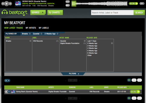
This is exactly the same Beatport page as the picture above, but with my stylesheet applied:

If you want it to look like that for you, here’s what you have to do:
(more…)
Categories: Misc // Tags: argh my eyes, Beatport, blinded, color, colour, CSS, dark, Firefox, Safari, stylesheet, sunglasses, theme
Comments Off on Beatport Dark Theme
alternative colour scheme for new Beatport


