Beatport Dark Theme
alternative colour scheme for new Beatport
18 July 2011
You may have seen that Beatport has had a facelift recently. The old creakily slow Flash interface that you needed to peer at with binoculars to read the text has finally been swept into the bin, to be replaced by a swanky new HTML5-based site. “New Beatport” has a nice clean design, and seems more responsive, and a lot more intuitive.
So congrats to Beatport, and indeed, yay… but I have a problem with it. It’s all gone a bit… well… white…
Maybe it’s because I spent my formative years programming on greenscreen monitors, but I’ve never found black text on a white background very pleasant to look at on a screen, and I dispute the rationale behind it which is leading to it becoming a de facto standard on the web. Black-on-white is certainly good for printed text on paper, but on a backlit computer screen, it means you’re staring at bright unfiltered fluorescent tubes (or LED equivalents) all day. I don’t think it’s a good idea for anyone, but it’s a more serious problem for me personally: my eyes are unusually sensitive to light and I really can’t be spending hours tune shopping on Beatport with the glare of a thousand suns boring into my retinas.
So I fixed it. One of the great things about increasing web standards compliance, is that it grants us, as individuals users, a great deal of flexibility to adjust aspects of a site to better fit our individual requirements and preferences, which can range from a small style tweak to full-scale dynamic page rewriting by the likes of Greasemonkey. But in this case, all I want to do is change the colour of various elements on the page, so a User Stylesheet is just the ticket.
Here’s my User Stylesheet to modify Beatport’s colour scheme. I wrote it mainly for my benefit, but I suspect there will be others of you who prefer the old Beatport colours of light text on a dark background, so I’ve made it available to everyone in the public domain. You may use and copy it without restriction.
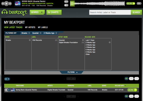
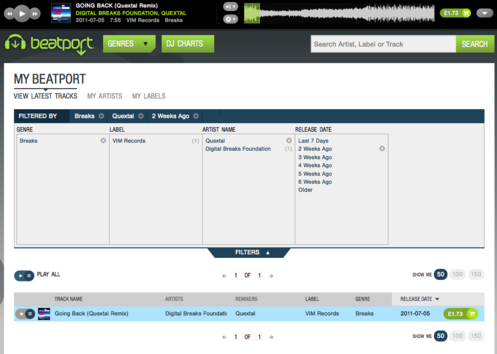
This is exactly the same Beatport page as the picture above, but with my stylesheet applied:

If you want it to look like that for you, here’s what you have to do:
If you use Firefox:
The easiest way is to install the Stylish add-on. You can then go to the Beatport Dark Theme page on userstyles.org and simply click the “Install with Stylish” button. Easy peasy. If you don’t want to install Stylish, then you’ll be downloading the file and putting it in a certain place on your computer; userstyles.org should have full instructions.
If you use Safari:
Use Firefox instead. You can get this working in Safari, but it’s loads more hassle. Firefox is the easy option.
If you really want to use Safari:
Alright then, but don’t say I didn’t warn you. Here we go:
- First you’ll need to install a couple of plugins: SIMBL and SafariStand. These are the only way I’m aware of to get per-site user stylesheets in Safari.
- After installing them, restart Safari to get them loaded in. There should now be an extra menu called “Stand” in the menubar.
- Load up www.beatport.com in Safari
- Go to the “Stand” menu, then “SafariStand Setting…”, then select “Site Alteration”. Make sure “Enable Site Alteration” is ticked, and click the “Add” button. This should add an entry for www.beatport.com. Tick the “Alter” checkbox next to “User Stylesheet Location”. Click on the little arrow next to this text field, which will pop up a menu, and select “Open User CSS Dir”. At this juncture you just need to know where it is.
- Grab the stylesheet from here and download it to a file in that directory. You might like to call it beatport-dark-theme.css.
- Edit that file in your favourite plaintext editor. Delete the whole line near the top that begins with @-moz and ends with an open-brace ({). Then go down to the very bottom and delete the very last close-brace (}). Save the file.
- Go back to the Stand configuration window you left open a moment ago, and put the full path to the stylesheet file into the “User Stylesheet Location” text field. You can now close that configuration screen.
- Clear your cache (Safari > Empty Cache) and reload Beatport. If that doesn’t seem to work, you might have to restart Safari again.
This ridiculous procedure (which is the simplest method I’ve been able to find) is only necessary because of the lack of builtin support for per-site user stylesheets in Safari, something Firefox has had for years. Since user stylesheets usually only make sense on a per-site basis, this seems a bizarre omission… Meanwhile, you are, of course, free to use Firefox instead, which, let me remind you, only requires one button press, and no restarts, to save your eyes from Beatport’s dazzling shiny brightness.
One thing I should mention. I am not affiliated to Beatport in any way (other online music retailers are available). This is a completely unofficial “patch” to a third-party site. So at some point they are bound to make a change to their site which results in an incompatibility with my stylesheet. It might just look wrong, or it might cause a more serious obstruction to your ability to use the site. If you encounter any problems using Beatport in conjunction with the Dark Theme, please disable the user stylesheet (trivially easy with Firefox+Stylish) and try again without it. I will endeavour to keep the stylesheet up-to-date with the site, but there are bound to be times when they drift apart. Your use of any of the code or techniques described in this article is entirely at your own risk.
Finally, if you find a bug in the stylesheet or have any suggestions for improvements, please do let me know. See the Contact page for details of how to reach me.
Categories: Misc // Tags: argh my eyes, Beatport, blinded, color, colour, CSS, dark, Firefox, Safari, stylesheet, sunglasses, theme
Comments Off on Beatport Dark Theme
alternative colour scheme for new Beatport


